I did a fun shoot yesterday with Susie and her boys in Freak Alley in downtown Boise. Total shade, a single stobe in an umbrella for lighting, very cramped quarters – I shot most of these with my back pressed tightly against the far wall. We had to move a garbage bin, the boys were boys and we got some pretty good shots.
Author Archives: TheArtist
The Bragg Family
Some shoots go better than others. Not 5 minutes after we started shooting I lost the sun. There was a very friendly cloud that the sun hid behind. So our lighting was very flat and very dim. We did the best with what we had and I think we got a few good shots.
The one with the sign was from an idea that Cassidy saw on Pinterest that she wanted to try.
Happy birthday Katie…
2013 Cross Country Season …
Teil and Ali – Engagement
Footeworks Dance Portraits
Even though I haven’t been posting much of late, I’ve been busy. I had 3 portrait sessions, two fairly large ones. I’ve built my initial workflow and have been fine tuning that using these projects. It’s working great.
Here’s the first of the 3. These are the final images form the Footeworks Dance Classes. This was a fun project. I love working with such beautiful young ladies.
Relationships and Facebook
A few days ago I wanted to put together a Facebook post to express my appreciation for the family and friends I’ve been able to connect to and stay in touch with because of Facebook. I find myself drawn there when I’m feeling lonely, or down, not because of the tool, but because of the people there. They have buoyed me up when I was struggling, they feed me when I need to keep going. And I’m able to return the strength to them when they need it. That’s why I love Facebook – because it gives me a way to stay in touch with the people I love.
But I have a rule. I’m a visual kind of guy. I want to express myself visually so I don’t ever post in FB without an image to go with it. So I put together this image to capture my feelings about these people who give me strength and companionship on this wild ride called life.
A Composite Exercise Part 2
As I mentioned in the previous post, I wanted to do another version of the Dance Composite with wider grid lines. So I went back to the previous image and pulled out the gird lines so they where wider. That actually made the grid MORE powerful. Everything became more – blacker, heavier, bigger. The opposite of what I was going for. So I tried different things to minimize the grid. I ended up minimizing it to the point of almost eliminating it. As I looked at it it felt like the grid didn’t really fit the rest of the elements. So I added just enough to use it to tie the overall image together, without being a significant element. At least that’s what I tried to do.
Tell me which you think works best:
The first:
The revised:
A Composite Exercise
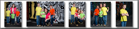
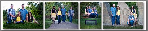
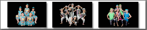
I’ve actually been pretty busy since I last posted. I shot Sr. Portraits for a friend and Class/Individual portraits for my daughter’s dance class. I actually made a couple of bucks on the dance pictures. I traded for the others. But money isn’t the issue at this point. I defined a workflow just before I did these two jobs so they were both exercises in following the work flow. It worked well. I need to make some adjustments, which is good. I think I’m close. I have the full tool set and the work flow to tie it together. It feels like it is starting to come together.
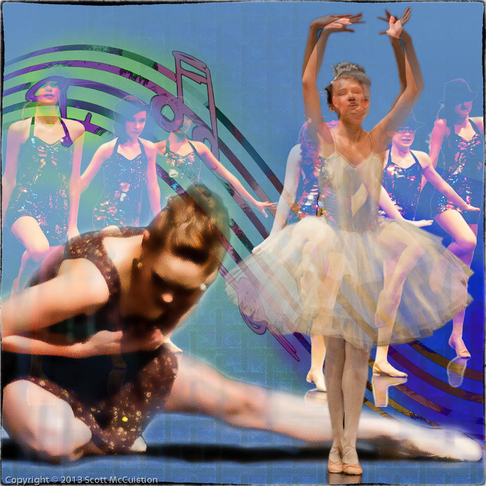
I’ve spent way to much time ‘learning’ Photoshop. Watching course videos and reading books. Now I need to actually start building things. To that end I’m going to take images that catch my interest and mimic that image. That will help me focus on the image, really examine it to understand what works, what doesn’t and work on my PS skills by building my own piece based on the original.
The first image I used is a TINY bit violent. I saw the image and was intrigued by the overall concept before I really paid attention to the detail. Sorry about that. But it gave me something to work from.
Here’s the original. I pulled this from a blog post by Chase Jarvis on ‘The Best Album Art’:

Here’s what I built:
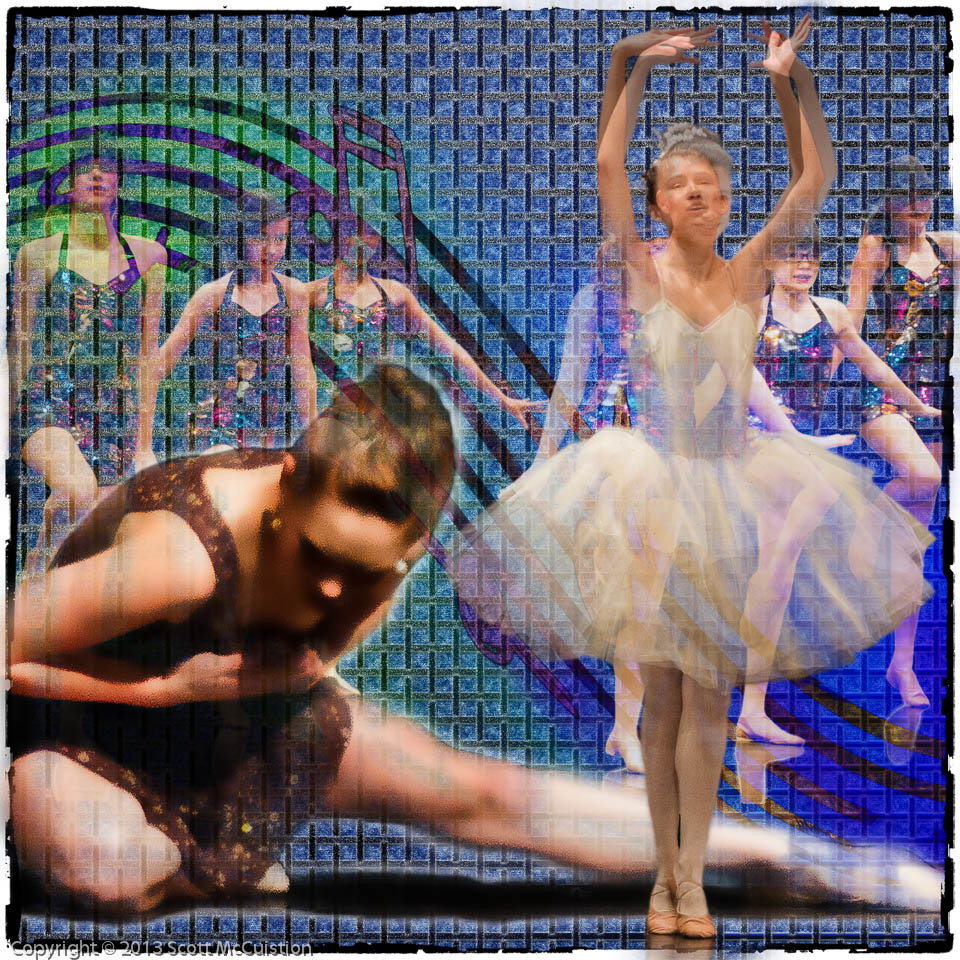
I think what caught my interest on the original was the grid and how the artist used that to pull the piece together. I’ve been struggling with how to build backgrounds, so I’m paying more attention to that than anything else at the moment. The background is what ties everything together. It’s the most important neutral element. It needs to be there, it needs to work, but it shouldn’t be obvious. Looking at the two together I’m thinking I should have made the grid less dense. It may be too heavy on this one. I may try one with it expanded and see how that works.
Feel free to give me your thoughts.
A Restoration
I’m enjoying these restorations. More and more they are convincing me that the part of this process I enjoy the most is the finish work. I love taking something that is damaged and making it look nice again. And some of these family pictures are so rare that they have such deep value.
This is my wife’s parents. She had an old faded 5×7 that was apparently made from a 2×2 original. It was framed without glass, so it was scratched up prettly badly and had dirt embedded in the emulsion.
Her hair is a little darker than I would like, but there just wasn’t any detail there. I’d rather have it too dark than washed out. Her neck was tough. The original was pretty bent up there so after being copied, then faded, then scanned it wasn’t pretty. I think its alright now.
It may not look like it but this is a step forward on my restoration process. Up until now I’ve pretty much just cleaned them up, modified the color balance and added contrast. On this one I replaced some missing elements. They are small (her hair and her chin) but they helped a lot.


