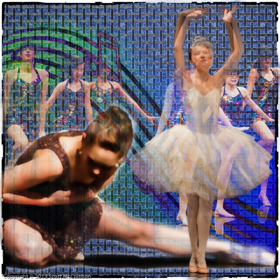
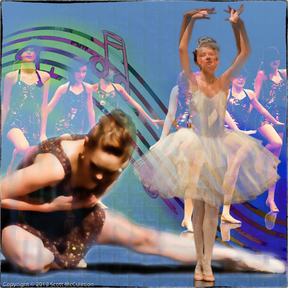
I’ve actually been pretty busy since I last posted. I shot Sr. Portraits for a friend and Class/Individual portraits for my daughter’s dance class. I actually made a couple of bucks on the dance pictures. I traded for the others. But money isn’t the issue at this point. I defined a workflow just before I did these two jobs so they were both exercises in following the work flow. It worked well. I need to make some adjustments, which is good. I think I’m close. I have the full tool set and the work flow to tie it together. It feels like it is starting to come together.
I’ve spent way to much time ‘learning’ Photoshop. Watching course videos and reading books. Now I need to actually start building things. To that end I’m going to take images that catch my interest and mimic that image. That will help me focus on the image, really examine it to understand what works, what doesn’t and work on my PS skills by building my own piece based on the original.
The first image I used is a TINY bit violent. I saw the image and was intrigued by the overall concept before I really paid attention to the detail. Sorry about that. But it gave me something to work from.
Here’s the original. I pulled this from a blog post by Chase Jarvis on ‘The Best Album Art’:

Here’s what I built:

I think what caught my interest on the original was the grid and how the artist used that to pull the piece together. I’ve been struggling with how to build backgrounds, so I’m paying more attention to that than anything else at the moment. The background is what ties everything together. It’s the most important neutral element. It needs to be there, it needs to work, but it shouldn’t be obvious. Looking at the two together I’m thinking I should have made the grid less dense. It may be too heavy on this one. I may try one with it expanded and see how that works.
Feel free to give me your thoughts.


