The camera that is with you…

Sunsets are fleeting, unpredictable things. Sometimes you just grab them. And the only way to grab one is to have something to grab it with.

We stopped in Burley to get gas. I always stop in Burley to get gas. Not sure why. But as I walked back to the truck I saw probably the most amazing sunset I’ve ever seen. The only camera I had with me was my phone. So I snapped 3 quick shots before it disappeared. A little Photo shop love and here you go. It’s not technically brilliant, but I can share it and remember that amazing sight.

Engagement Composite

This is the composite I put together of our Engagement images. I wanted something a little more personal, that would show more of our personalities than just a single image.

Here’s a list of the elements I used and what I was thinking when I used them:

  • Background with our shadow. Provides a nice base layer but still ties everything together with the directional shadow shapes.
  • Floating leaves. They add an earthy feel – fills the blank spaces.
  • Handwriting adds a level of meaning, expands the story line and adds an organic element.
  • A scan of the pot Cheryl built on our first ‘date’. This provides a touch of the history of the relationship. That ugly little pot has become very significant to the relationship.
  • A hand colored couple shot. I like the feel of that look, as I’ve talked about in the last couple of posts.  The more graphic, less detailed treatment softens the overall piece.
  • An aged black and white couple shot. This adds a sense of time to the image. It provides a sense of history, one that doesn’t exist yet, but hopefully will be long and rich.

This isn’t mind shattering, but I think it shows a positive progression.

Hand Coloring – RGB vs. CMYK

In my last post I explored Hand Coloring an image. I used the RGB Color Mode. The tutorial I was kind of following said to use CMYK. At the time I thought RGB worked fine. In fact I mentioned in the previous post that he said to use CMYK and I used RGB.

The reason I used RGB? Because it is my default mode and by the time I remembered to change it to CMYK I’d done most of my mods and added a bunch of layers that would be deleted if I moved from RGB to CMYK. (big breath) It’s called stupid laziness. Not really a suggested design strategy. Although I expect most of us practice it more often then we’d like to admit.

I liked the affect so I decided to try it again on another engagement image. As before, I did all my mods and adjustments then started my hand color process before I thought to change to CMYK. Of course I didn’t want to lose my previous work, so I just kept going. Later, it started to bug me. So I decided to do it again, this time using CMYK.

This is the side by side comparison of the two treatments. The first is RGB. The second is CMYK:

I expected the difference in having the black channel would give me control over the luminance within the color. And I was right. That additional channel allowed me to dial in the luminance of the color.  While the RGB mode worked, the CMYK provides more control and more depth.

I still like the first one I did, but for this one, I preferred the CMYK version better. It had more depth, the colors were more natural and overall it was easier to get what I wanted.

Hand Color Engagement Image

We did family pictures and engagement pictures a couple of weeks ago. It was a big shoot. I did 2 studio setups and 2 locations for 5 kids and 1 adult, in 3 different groups – her kids, my kids and our kids. Then I handed my camera to my daughter and she did couple shots for the engagement, both studio and on location. First I went through the family and kid pictures which I posted in my previous entry. Then I moved on to the engagement image.

There was one picture I really liked. The composition was good, the moment was great. Lighting was alright. It was almost a wonderful shot, but it needed something. And going in I wanted to do something with some grit, some character.

I started with this (after basic LightRoom adjustments, cropping):

I went out to the internet and searched for Photoshop Instagram effects – looking for ideas. I found a couple that I liked, one using a Threshold adjustment and one on Hand Coloring.

I started with an exploratory and came up with the following:

Then I started with a new canvas and built the final, using higher resolution images:

The Steps to build the final image:

–   Background copy – no changes made

  • In the exploratory I added grain to this level, but decided I liked it better without

–  Converted to Black and white

  • I did this in two layers, one for Scott’s face and the area below the window (B&W Scott) and one for everything else.  When I lightened the faces by adding Yellow and Red it was losing highlight on Scott’s forehead against the wall. And the colored area below the window was losing its detail – I wanted to maintain enough to color.
  • B&W Scott (masked)
  • Reds: 40
  • Yellows: 60
  • Greens: 40
  • Cyans: 60
  • Blues: 20
  • Magentas: 80
  • B&W Cheryl (masked)
  • Reds: 79Yellows: 11
  • Greens: 40
  • Cyans: 79
  • Blues: 71
  • Magentas: 80

–  I added a Threshold Adjustment layer to drop out the fine details and add a graphic feel.

  • On the exploratory I got a lot more texture – but when I used it on the higher resolution image the range was much finer so I didn’t get the same amount of texture.
  • Had to adjust the Threshold level and the Opacity to get the affect I wanted.
    • Threshold Level: 76
    • Opacity: 12%
  • I had issues with the shadow areas
    • Blocked the hair out on the Threshold layer.
    • I had other shadow areas that were very blotchy, I decreased those shadows using the Localized Burn/Lighten layer until the blotch went away. This worked really well

–  Added Blank Layer for localized Burn/Lighten

        • Blend Mode: Overlay

–  Added Blank Layer for localized Burn/Lighten around Cheryl’s lips

        • Blend Mode: Overlay

–  Added Curves Adjustment Layers to hand color individual areas. Selected the area to be colored, then added the Curves Adjustment Layer, which masked out the selected area

        • Skin
        • Scott’s Hair
        • Cheryl’s Hair
        • Window Shadow
        • Below Window
        • Window frame
        • Scott’s Shirt
        • Far Right Shadow

The Tutorial I used said to change the Image Mode to CMYK. That adds the black layer. But I used the default RGB image mode.

I really like the way this turned out. It gave me just enough graphic grit and dropped out some of the fine detail.  That actually solved some of my lighting challenges on my face by softening the shadows. The hand color gives it a soft translucent watercolor look.

Here’s the final:
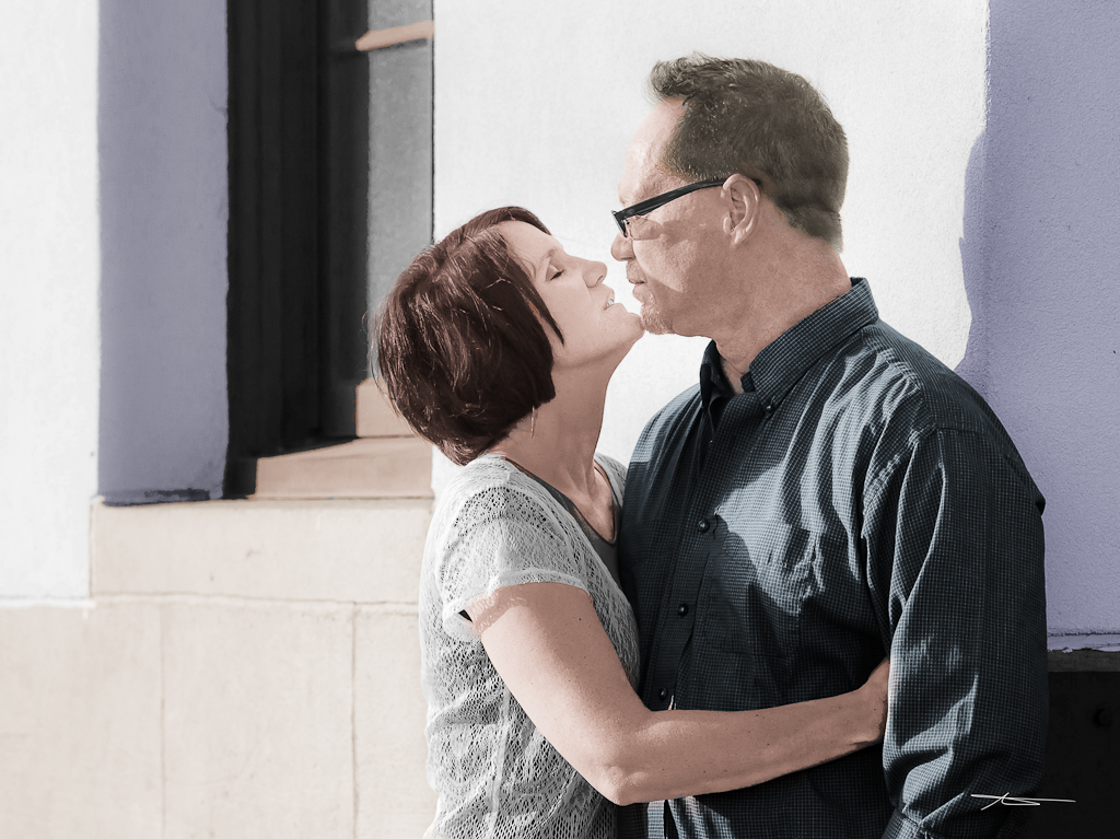
Here’s what I started with, for side by side comparison: