BW Versions of Yesterday's HDR

Just to take yesterday’s images the next step, I converted the two tire pictures to B&W to see how they fared.

I converted them using CS3’s Black & White  Adjustment tool. To keep the comparison fair, I used the same conversion settings (established for the HDR image and copied on the straight image):

  • Red   27
  • Yellow 30
  • Green 55
  • Cyan 53
  • Blue 188
  • Magenta 60

I adjusted Blue the most to get the detail in the tire the way I wanted it. Yellow darkened the background a bit.

Then I adjusted them both in Levels for Black/White Points and Midrange  (2 – 1.07 – 249). Again, I kept them the same to provide a clearer comparison.

This is the B&W version of the non-HDR image:

2009_0612_DSC_0009-BW_sm

This is the B&W version of the HDR image:

2009_0612_DSC_0007_08_09_10_11_HDR_BW_sm

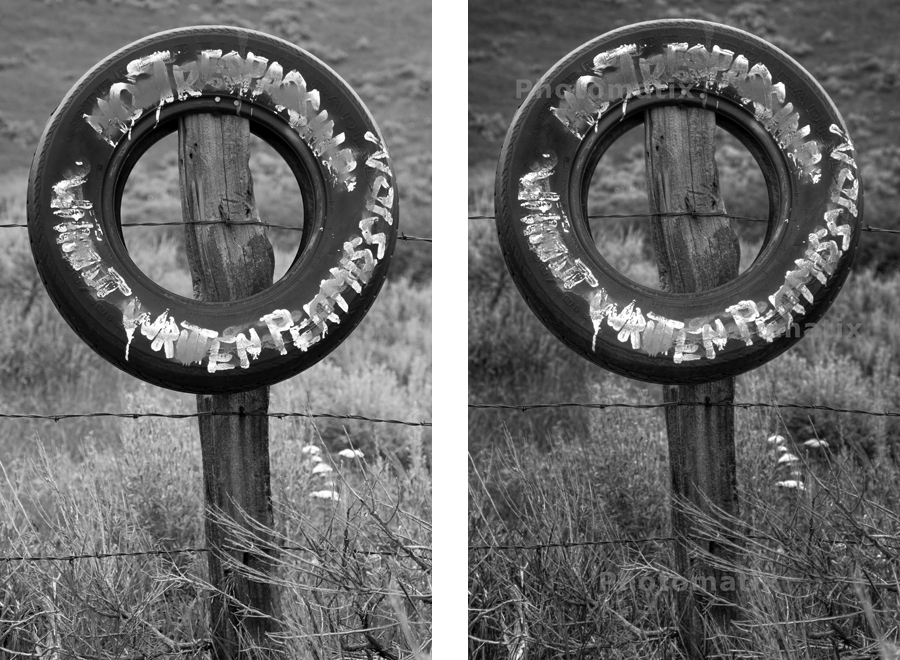
And here they are smaller, but side-by-side:

2009_0612_DSC_0009_HDR_SideBySide_sm

The back grounds are different, but that could be adjusted if I focused on refining each one to to it’s own range.

The straight image pops more because of the stronger blacks – the HDR shows a fuller range of values, dropping the pop factor for the greater range of detail. The full Black and Whites are there, I dialed them in using the Levels adjustment. But since there is less over all it flattens just a bit. But I enjoy looking at the HDR image more – there’s more to look at. Like looking at an Ansel Adams, the more you look the more there is to see.

Now I need to explore pulling an HDR from a single raw, for those moments when you can’t bracket – or when there is a variable element in the image – like a person who refuses to sit completely still. We’ll see where that goes.

2 More HDR

First, just to get it out of the way, I have a thing for signs. Texture and signs. Better yet, texture on signs. Someday maybe we’ll get into the why. For now, we’re just going over the how. Particularly, the how as it relates to HDR.

I did two shots today. For both I put the camera on a tripod to get past the registration issue I had with Photomatix on my last set of hand helds. I also shot 5 shots of each, 2 stops each side of correct. I’ve only done 3 shots before, 1 stop either side of correct.

These were taken on an overcast day, very flat light. So not much contrast, beyond the contrast within the subject itself. One had a lot, the other not so much.

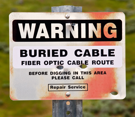
The first one is a painted metal sign on a metal post. I liked the color transitions from the weather induced fading. Some subtle texture on the post. And the bullet holes – always an interesting commentary on man’s base instinct when you put a gun in his hand. Sorry, I regress…
2009_0612_DSC_0004_sm

This is the straight, non-HDR image at the correct exposure.

I Lightroom’d it – adjusting the white and black points – a lot (flat subject in flat light). Popped the color balance, burned the edges and cropped in tighter.

This is the HDR image, after the same basic Lightroom adjustments (after the HDR process). The only significant difference was the white/black point adjustments weren’t as dramatic.

2009_0612_DSC_0004_5_6_1_2_3_HDR_sm

Still using the demo copy of Photomatix – hence the watermarks…

The differences are not dramatic. The most obvious difference is the blacks aren’t as intense in the HDR. Normally I like the more powerful blacks. Pops more. But as you spend more time on the HDR image you start to see more subtle details, a bit more detail overall. And that would be why the black isn’t as intense – there’s more detail in there. Check out the orange overlay on the left side of the black bar around ‘WARNING’. It’s completely gone on the straight image.

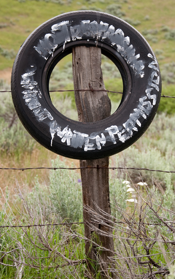
The second is another, more creative sign.

This is the non-HDR image at the correct exposure with the same Lightroom adjustments as the previous image, without the edge burning:
2009_0612_DSC_0009_sm

In this case there is a lot more detail in the image itself due to the white paint on the black tire.
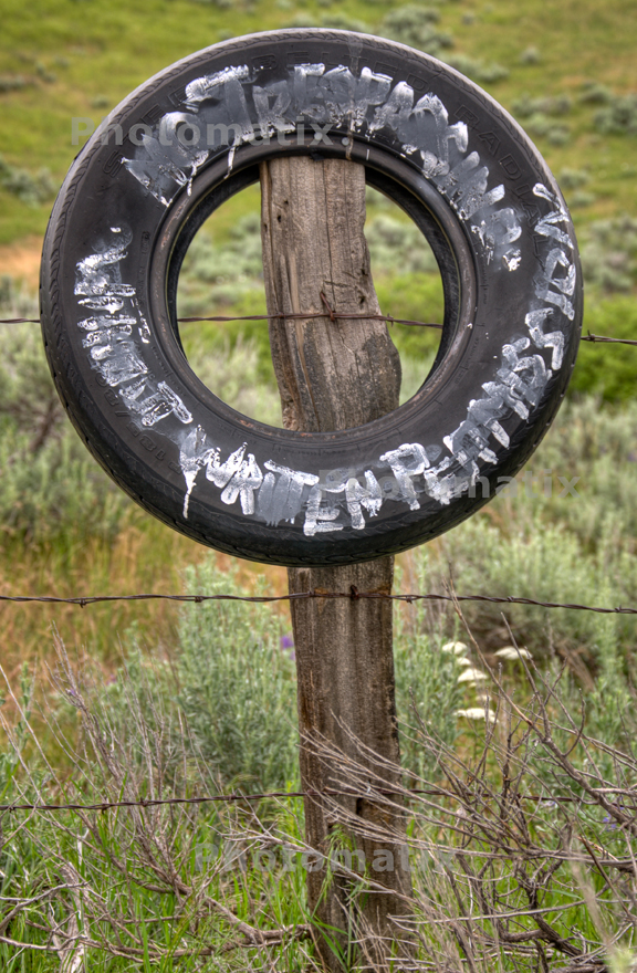
2009_0612_DSC_0007_08_09_10_11_HDR_sm

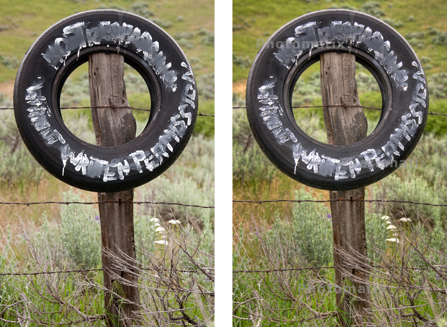
Again, the blacks are less dynamic in the HDR because it captured a great deal more detail than in the straight image. It is more obvious in the tire over the metal sign because there is so much more detail in the blacks of the tire than in the black paint on the sign.

The greens in the back ground are also much richer in the HDR than in the straight image. That would be due to the difference in the range between the black of the tire and the background in the base exposure. In order to lighten up the tire in the ‘correct’ exposure it over exposed slightly, washing out the background colors. The HDR composite was able to restore that.
2009_0612_DSC_0009_HDR_SideBySide_Color_sm

Overall – I really like the effect. Very much like the effort I made in my Black and White with my Simplified Zone process.

As a follow up to my previous post about whether HDR is a Fad or a valid technique. The HDR images that are out there are all powerful, very dramatic images. A lot of detail. But, in a general sense, they push the image to the side of dramatic impact. And it works. But I think that is what many people are pushing back against when they rip on HDR.

What I like about it is the exact opposite. It is the ability it gives me to capture and display the subtle detail that is lost due to exposure range limits. With my Simplified Zone I’d meter the highlight, the black and determine the number stops in between. I’d expose the image between the range marks. Then I’d adjust the development to push the range out or pull it in, depending on the range between the stops.  It only really worked on the view camera since I could process each exposure individually. I’m doing the exact same thing here for the same reason – to get the full range of detail.

That – I believe – is the valid, long term use that HDR provides. The other, while beautiful and powerful, I expect will go the way of other fads. It will fade away when something else comes along.

Meanwhile, the serious artist will use it subtly, carefully and to great affect.

A phrase worth some consideration

From David duChemin on his blog at: PixelatedImage.com

He discusses the question we often ask before we commit to an endeavor: ‘Am I good enough?

To often we forget to ask: ‘Do I love it enough?

It takes both. Maybe more of the second than the first.

He closes with the following:

Whatever the next step for you is, take it boldly. These are not times for the timid;
there’s no reward in tiptoeing through life only to make it safely to death.

Wow, in half a sentence he states what I’ve been trying to incorporate into my sense of being, into my way of living – to step up and LIVE life, not just exist.  To do – not just observe.

HDR with Photomatix

I ran the same images I did my last HDR from through Photomatix to see what you get from paying for something (except I haven’t paid for it yet – doing the trial thing – but it’s supposed to be the same thing).

Here’s the SOOTC  jpg images:

20090328-dsc_0050_sm

20090328-dsc_0049_sm

20090328-dsc_0048_sm

Here’s the HDR that I produced using CS3:

desk_hdr1_sm

I liked the details it picked up in the shadows, but was disappointed that the window washed out.  The colors are also washed out.  The alignment was spot on.

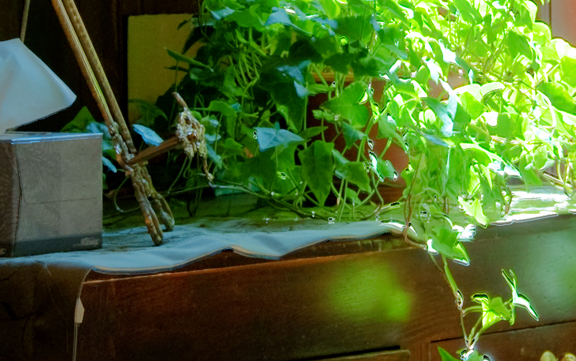
Here’s the HDR I produced using Photomatix Pro3:

20090328-DSC_0048_49_50_Photomatix_HDR_sm

The final result was actually a lot darker than this so I added some fill to brighten it up.

The colors just blew off the page. I actually had to pull back the magenta/red cast – added a bunch of green and blue. That brought it into better balance. But still, compared to the CS3 version the color is just in the wow stage – big difference. I was amazed at the amount of reflected green cast that came off of the leaves.

It also kept the details in the window and didn’t let that burn out. Not that a brick wall is the sexyist thing in the world, but I can tell what it is now.

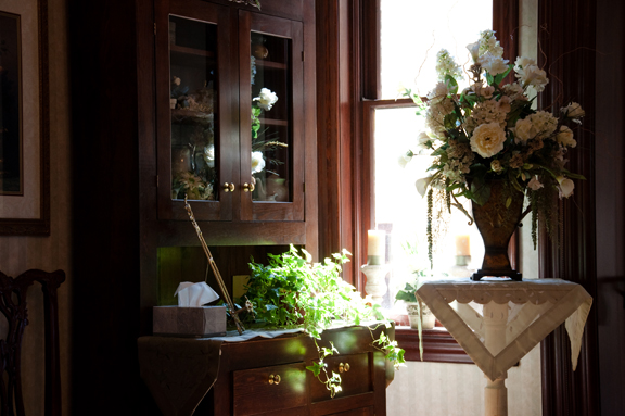
Except for one thing it is a great improvement. The alignment is off. The CS3 image lined everything up perfectly, but Photomatix left a slight overlap.

CS3 Alignment detail:

DESK_HDR1_sm_detail

Photomatix Alignment detail:

20090328-DSC_0048_49_50_Photomatix_HDR_sm_detail

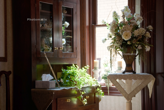
Another feature of Photomatix is Blending. I tried that to see if it would balance out the window detail and what it would do in the shadows:

20090328-DSC_0048_49_50_Photomatix_Blend_sm

As expected, more detail in the window and everything else not as dramatic as the HDR. Again, the alignment is off a tad. That’s disappointing.  I realize I can help that by using a tripod, but CS3 did such a great job lining it up I’m surprised Photomatix didn’t. Oh well. Time to dig into the tutorials on the Photomatix site and see if I can do better next time. Shot some more images last week end I can try out.

—–

I actually got 3 hits on the site over the past couple of weeks – of course while I was completely ignoring it. Two came from a comment I posted on pixelatedimage.com and another without a source.

The moment of excitement was immediately overwhelmed by the feeling of horror that people actually looked at the crap I’ve got up right now.  The duality of displaying your work and exposing your thoughts/feelings/efforts. Excitement that others can share and experience it with you – fear that they might not like it and or you.