Photoshop Free Transform

After too many years of bad software help files I’ve stopped believing that there is anything helpful behind the help button. Instead I buy the book and think that is better.

Photoshop is changing that. There are so many Photoshop books out there its easy to forget that the program comes with help. And its good stuff. Even more important it is a base level of information that the books skip. Sure they show you how to change images from this to that. They tell you what buttons to push, but they don’t put them in context. So I can use a command for that one thing, but I’m missing out on all the variations of the tool.

Until I push the help button. For free…

I pulled the following from the Photoshop help on Free Transform and added examples.

 Free Transform

The Free Transform command lets you apply transformations (rotate, scale, skew, distort, and perspective) in one continuous operation. You can also apply a warp transformation. Instead of choosing different commands, you simply hold down a key on your keyboard to switch between transformation types.
Note: If you are transforming a shape or entire path, the Transform command becomes the Transform Path command. If you are transforming multiple path segments (but not the entire path), the Transform command becomes the Transform Points command.

Select what you want to transform.

Choose Edit > Free Transform.

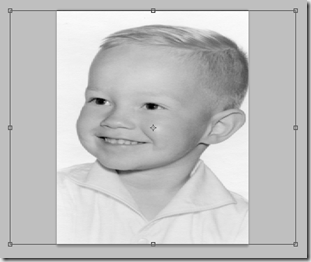
To Scale by dragging, drag a handle. Press Shift as you drag a corner handle to scale proportionately.

image

To Rotate by dragging, move the pointer outside the bounding border (it becomes a curved, two-sided arrow), and then drag. Press Shift to constrain the rotation to 15° increments.

image

To Distort Relative to the center point of the bounding border, press Alt (Windows) or Option (Mac OS), and drag a handle.

image

To Distort Freely, press Ctrl (Windows) or Command (Mac OS), and drag a handle.

image

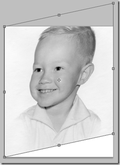
To Skew, press Ctrl+Shift (Windows) or Command+Shift (Mac OS), and drag a side handle. When positioned over a side handle, the pointer becomes a white arrowhead with a small double arrow.

image

To Apply Perspective, press Ctrl+Alt+Shift (Windows) or Command+Option+Shift (Mac OS), and drag a corner handle. When positioned over a corner handle, the pointer becomes a gray arrowhead.
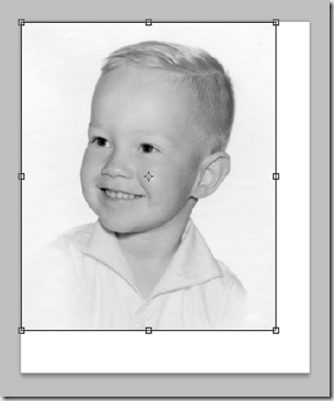
image

Power Image–Part 2

After a lot of years developing software I’ve learned that the best result seldom happens the first time. There are those times when I’m just about done with a change and something happens and I lose it all. The computer bombs, I press the wrong button, something. I holler, swear and call myself names. Then I start over and rebuild it. And almost without exception I return a better product. The first time becomes the dry run, the practice run. I make my mistakes and figure out the details. Then when I do it the second time it falls together more smoothly.

What’s hard is when the mistake isn’t made and I have to push myself to throw away a perfectly good product and do it the second time. In the work place its not going to happen. The first attempt works and my boss isn’t going to take my argument that it will be just a bit better if I do it all over again. But I can with my art. It’s still hard to do it again, to convince myself that if I do it again it will be worth it. But it is.

The other thing that helps a lot is to live with it for a while and see what starts to bug me. Then do it again and fix those things.

And it’s always worth it. I get a better product and my skill set is stronger when I’m done.

That’s what I did with the helo shot I posted a few days ago. It looked good, but I knew it could be better. So I went back, cleaned up the original cut-out and put the wheels back in – after researching and establishing this machine flies with the wheels down.

This time around I’ll include the pieces I used to build it.

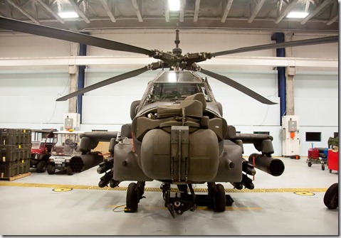
Here’s what I started with. This was shot in the hanger at the airport:

2011_0125_Apache_0014


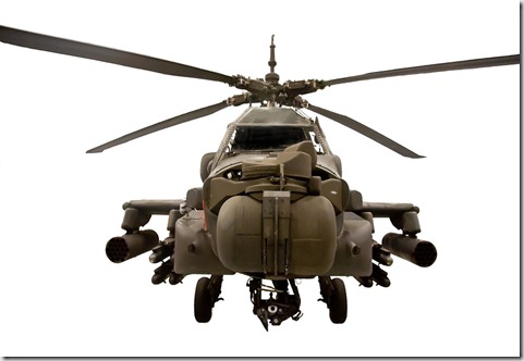
I cut the bird out and cleaned up some things:

2011_0125_Apache_0014-Edit


I dropped in a great sunset cloud shot I took with my phone last summer:

2010_0529_FromPhone_0023


Then I finished it:

  • I copied the base image and dropped in a radial blur to add a sense of movement to the rotors. I adjusted the strength until I liked how it looked
  • I painted out the body on the layer mask.

The effect was good, but I wanted a bit more volume so I didn’t completely lose the rotors.

  • I copied the base image again and added a Gaussian blur. I adjusted it until I had the volume that felt right
  • I pulled over the same layer mask I used in the Radial blue layer.
  • Then I adjusted the opacity until it looked right
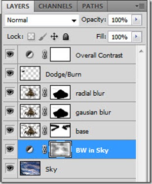
  • Next, I added the Dodge/Burn layer. I add a blank layer, set the blend mode to Overlay and paint with black to darken or white to lighten with the brush opacity set to around 20%. After each stroke I adjust the stroke using the Fade Brush Tool (Edit/Fade Brush Tool). I don’t use the Dodge/Burn tool, I feel like I have more control this way. On more complex images I’ll set up different layers for Darken and Lighten, but I combined them on this one.

The sky was too blue. I wanted it to be a bit more dramatic, less pretty.

  • I added a Black and White Adjustment layer to the sky layer and adjusted the Blue and Cyan sliders to adjust the contrast till I liked it.
  • Then I painted out the B&W affect on the layer mask using a grey brush to bring some color back in.
  • Then I added a Curves Adjustment layer to darken and increase the overall contrast.

Here’s the final layers panel:

helo_layers

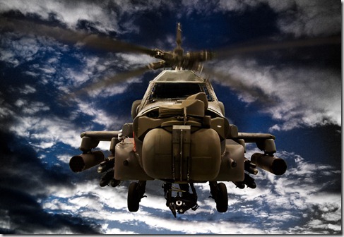
And here’s the final image. Not dramatically different, but the little things make all the difference.

2011_0125_Apache_0014-Edit-Edit

A sense of perception

A couple of weeks ago we went to see the Apache Helicopters. I’ve always wanted to see one up close and personal. From pictures I’ve seen I’ve always had a sense of complete unbridled power! To me they represent the most naked physical form of pure power to me. That didn’t change when I saw them in person. Even more so.

We saw them in the hangers. I took some snapshots of my son checking them out. And I took a few profile shots. I pulled one of those profiles up to work on my selection/cut out skills. After I cut it out I started to play.

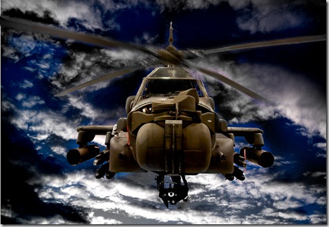
This is what I came up with:

2011_0125_Apache_0014-Edit2

This pretty effectively captures my perception of this machine.

A thought popped into my head as I was looking at this image.

I tend to wonder why people are so anti-USA. Intellectually I understand why, but I still wonder why they can’t see the good we try to do, the effort we put into building and helping. Then as I was looking at this I thought – this captures the representational vision many people have of the USA. The visual representation that pops into their head when they think of the USA.  Instead of the dove or the flag or the soldiers giving candy to kids they see this – a representation of the raw force that we wield to obtain our ends.  While I believe our ends to be positive, I suddenly perceived a sense of the fear we must engender to those who are not on our side of the gun. In this case – a very BIG gun.  Actually a LOT of very big guns. And I am very grateful that the nation that possesses such vast power tries to use it for altruistic ends. We don’t always succeed – in fact we fail quite often. But how much different it would be if the nation which possesses such vast, unbalanced power did so primarily for selfish ends.

Such is the power of a single image.

A couple of things from Permission to Suck

Here’s a couple of quotes from yesterday’s  ‘Permission to Suck’  post that hit home for me:

Using your instincts as a creative person means staying within yourself.

Make sure that every influence you’re connected to is filtered through your unique voice. Perhaps it’s best to keep it inside long enough to forget inspiration’s origin. Use the artifact of influence before it’s time and you’re work is a copy.

Without an original voice – without artistic instincts – you resemble a marketer. Producing what you think will sell; a trend chaser.

While copies are OK, they aren’t quality in the full sense of the word; they’re a lie as soon as you put your name on them. Influences, given time to incubate, are the nutrients of your unique voice. No matter how similar the final result, if you’re honest with yourself, don’t you instinctively know when they’re yours or a copy?

I know I do.

A Permission To Suck Manifesto law:

6. Your creativity is about your heart, not their surface. Creativity is your world view filtered through your talent. It’s your passion, experience, expertise, inspiration and your rules that drive you to create wonderful things that you’re destined to hate because they’re not good enough, and others are open to admire because they couldn’t do it.

DRSBExercise 6

A major point Ms. Edwards tries to get across in her book ‘Drawing on the Right Side of the Brain’ is that you shouldn’t attempt to draw recognizable shapes and objects. We have in our minds a stylized idea of what a face looks like, what a body looks like. So when we draw a face we base it on what’s in our mind, not what is in front of our eyes and what we draw is distorted by the stylization that lives in our heads.

Instead, we need to draw what we see. We need to ignore what the ‘logical’ side of the brain is telling us and draw what is in front of us. Not a face, but a series of inter-related lines, shapes and values.

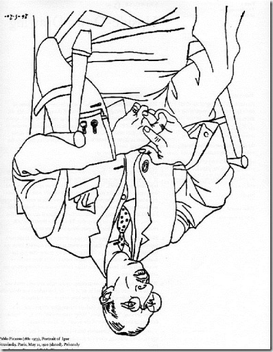
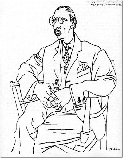
One common exercise is to copy an upside down picture. In her workbook Ms. Edwards provides 4 pictures to copy. The one I copied is a Picasso drawing of Igor Stravinsky.

Here is the image as I saw it:

DRSB_6a


Here is the picture that I drew:

DRSB_6b


And here is Mr. Picasso’s version right side up.

DRSB_6c


My guy is a bit fatter, his head longer and he grew an extra finger, but all in all, not bad. It wouldn’t have come out this well if I had drawn it right side up. Then I would have been trying to copy the person. Instead I concentrated almost exclusively on the lines and their relationships with one another.

It really does work.

DRSB Exercise 3–Finally

I finally finished Exercise 3 from Drawing on the Right Side of the Brain. I think more because I left it out on my desk so it was in the way than that I was motivated and driven.

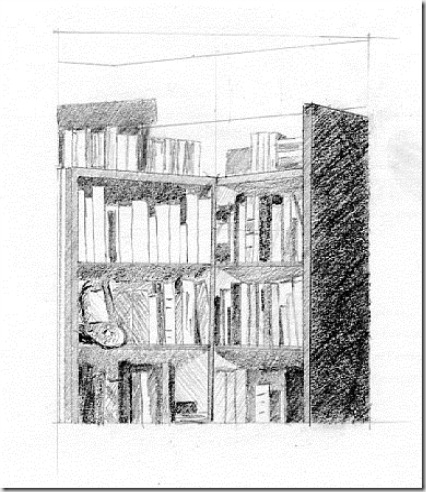
The exercise was to draw a corner of a room. So naturally (and despite the obvious sarcasm) I selected the busiest, most complicated corner I had – my book shelf. It turned out alright. It took 3-4 sittings to get it done. Some sittings I concentrated more than others. But it is done and I can move on.

BookShelf


The new year has begun. I’ve put all of the pieces in place. Now I just need to revolutionize my life, leave behind the last 15 years of bad habits and make something of my life I can be proud of again.

Wish me luck.

Its all about the sweat and the pain

This post from Permission to Suck expands on the spirit of my first ‘What is Beauty’ post.  The image on the wall created by a person who paid a significant cost to make it intrigues us more than the image on the wall created by a machine via a formula.  They may be ascetically comparable – heck, the formula generated image by even be superior, but we admire and respect and value the man made image because of the effort and the skill that went into it. The final piece represents the victory of the human mind and hand to overcome the challenges to make it. The same spirit we admire in the sports world exists in the art world. The greater the pain, the more complete the victory the more we admire the result.

It’s not as much about the final image – it is more about how the artist got there.

We value the Michelangelo ink sketch more than the most intricate piece from our local art student because those few lines capture everything Michelangelo went through to become the artist he was. I hung a lot of student art which I don’t remember at all. But the Michelangelo ink that I held briefly is burned into my memory. We celebrate Van Gogh’s madness and see it in the swirls and ridges of his strokes. I’ve often wondered if his work is a result of his going mad, or was going mad the result of his work. Either way the spirit is there. The frustration, the dedication, the passion.

I can make images today that are technically superior to Stieglitz. I have better tools, better paper, superior inks. Even ascetically I think I can compete or even better him. For example – ‘The Steerage’:

image

This image has never really done much for me. Composition isn’t bad. The lines break up the planes nicely, add some interest to what is basically a crowd shot. Some interesting shapes. But it’s a crowd shot. I’ve taken lots of crowd shots – I’m not big on crowd shots. So why is this one so valuable? It is a well composed crowd shot.  A moment in time that doesn’t look to bad. Does that make it special?

But put it in the context of the time, the tools used, the man who took it, the journey he was making to becoming a significant player in the development of American art, then it has interest. Then we stare at it and make up reasons why it is significant.

Here’s a quote on ‘The Steerage’ from Wikipedia:

The Steerage is a photograph taken by Alfred Stieglitz in 1907. It has been hailed as one of the greatest photographs of all time because it captures in a single image both a formative document of its time and one of the first works of artistic modernism.

Nothing there about how beautiful it is. No, it’s about the person, the place, the time.  If you don’t know the history behind it, it holds no real interest. You’d walk by it in the museum. You might think, “There’s an interesting crowd picture” and continue on.

Photography’s key draw is its ability to capture a moment in time. The elements of that image actually existed for that moment. Photography is an effort of exploration, of finding. You don’t go out to build a photograph, you ‘find’ a photograph. You may build the set, but the photograph itself is not the set – it is a representation of that set in a moment of time. Now PhotoShop is blurring that line, but in its purest state, it is reality captured in a moment of time. Add skill, technique, the flow of life around and in the image and something intriguing and ‘beautiful’ is created.

Here are some quotes from the Permission to Suck posting. It’s called ‘Creativity is Interesting, Virtuosity is Inspiring’. Please read the whole thing. It’s worth the effort:

Well… to be honest, I’m getting a little tired of hearing about how creative I must be; F%$# you, I’ll be who I am – you go and be fresh and new and different, I’m going to concentrate on being a better me.

Creativity is a common and natural act. Yet, being a virtuoso is the ultimate analog goal requiring sacrifice. Great musicians, fine artists, writers, and even athletes inspire awe in what is possible when a life is devoted to skill honing and potential accomplishment. Success is visceral.

The devotion to a skill that produces useless beauty is virtuous. Aesthetic aptitude + highly skilled craft + just enough creativity to be interesting = Virtuosity. This equation says nothing about being original just to be original.

To be authentically original is to make the sacrifice to be a virtuoso.

I’m thinking when I break this need to do impressive work for other people, when I transition to doing it to push myself, to see what I’m capable of, then I will have the chance to do something excellent and amazing. Anything else is simply a drive to mediocrity.

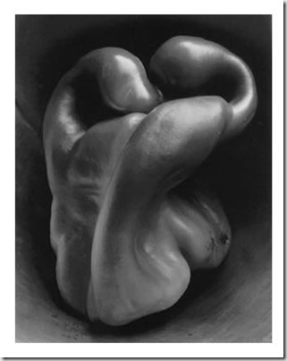
Something like this pepper by Edward Weston. I love this. You may or may not, but I do and that’s the magic of the whole concept. There’s beauty in this image for me because of what Weston did with a common place object within the realm of his art.

image

Find it and live it


Watching this brought back the question I’d asked JP (John Paul Caponigro) when I was in Moab in May. Standing there on a corner of a motel parking lot on the street of Moab with cars and trucks rumbling by. I remember the place, his face, his voice, but the message was slipping away. In this two minute clip Kevin Spacey repeated it and brought back that moment – same words from two great artists.


Drawing 101 – Again

In my last post I referenced an article by Trey Ratcliff on the 10 Principles of Beautiful Photography.  One of his 10 principles was to learn to draw. That really surprised me since I’ve never seen or heard a photographer suggest learning another medium. <Broad Generalization coming up> Photographers gripe about being accepted as artists, but then they never seem to include other visual mediums in their artistic processes. That is either because they are elitists, or they don’t have the skill to dabble outside of the photo world. That may seem to be a harsh statement, but in my case it is true. I’ve always felt that I took up photography because I didn’t think I could do any other type of art. I wasn’t  ‘talented’ enough. The draw of photography is the entry cost is so low. Especially now. You spend some money, buy a camera, point, shoot and you’re creating passable images. Yes, there is a great deal to learn and practice to really become proficient. But that first image doesn’t really take much effort to look decent.

Where as drawing a picture and getting a nice result on the first attempt is challenging. It takes more more time, concentration and effort to come up with something decent. The materials are simple and abundant, but the effort is much greater than snapping a picture.

I’ve always wanted to be able to draw. My first real exposure was in college. Photography was taught in the Design Department at BYU. So we sat through a bunch of non-photographic classes, which I loved. One of them was Drawing. The most important thing I learned in that class is that I actually could draw, if I made some effort. But I didn’t keep it up after the class – one of the bad choices I’ve made in my life.

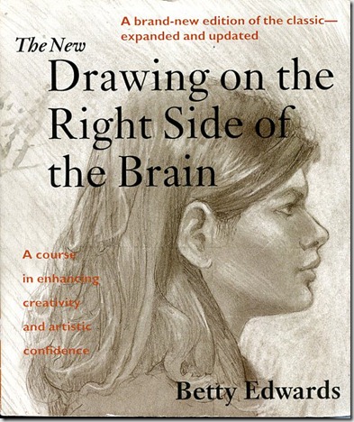
So as part of my creative resurrection I’m going to learn to draw. I finally found a couple of books that hit the mark. The first one is ‘Drawing on the Right Side of the Brain’ by Betty Edwards. It is a great approach to learning to draw, with practice exercises and lots of theories and quotes for those who want to pretend that they are learning by reading and never actually pick up a pencil. (That would be one of my challenges…)

BookCoverDRSB

At first I thought it was a book about being creative so I didn’t buy it.  Then I read a review on it and gave it another shot. Great book.

The other book I found that I love is my anatomy book. I’ve been looking for a good one for years and finally found this one:

BookCoverAnatomy

Starts at the bones, adds muscles, skin and lots of great stuff. They include proportional systems for Heads, 3 quarter and full figures. A wonderful book.

Now all I have to do is sit down and actually draw something.

A few weeks ago I drew almost every night for a whole week. Then I stopped. On Sunday I was talking to an artist friend/neighbor, Anne Sorensen. She does beautiful water colors. In the course of the conversation she made/encouraged me to commit to draw a half an hour a day. So that got me going again. Two days into it and I’ve got a perfect record. Thanks Anne.

So, I’m working through the exercises in ‘Drawing on the Right Side of the Brain’.

Now, I’m going to do something I haven’t been excited about. I’m going to post my attempts. The thought of doing this is hard and humiliating, but mostly from the simple fact that nobody reads this thing, I think I’ll give it a shot.

And maybe I’ll actually show some improvement.

First exercise – a self portrait.

Just to show that I’m not completely hopeless, the first image is the self portrait I did in college. The second is the one I did last night. Neither are amazing, but I think the second shows I haven’t lost everything I learned 30 odd years ago.


Self Portrait_83

This is actually a copy of my Sr. picture from high school. My hair really wasn’t that long at BYU.

Self Portrait_10

I promise this is the same person. Both even look like the subject, I’m sorry to say.

Tonight’s exercise was to draw my hand:

Hand_10

I’m glad to say my middle finger isn’t actually broken.

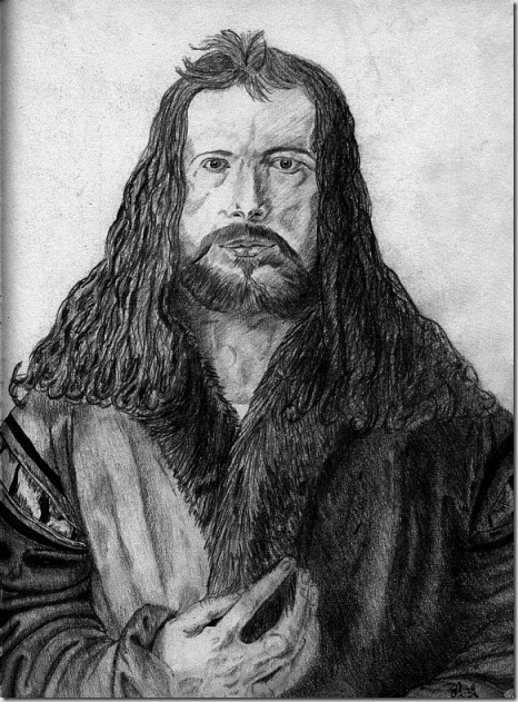
But just to finish this off on a positive note, this last picture is my final project from my college drawing class:

Durer_83

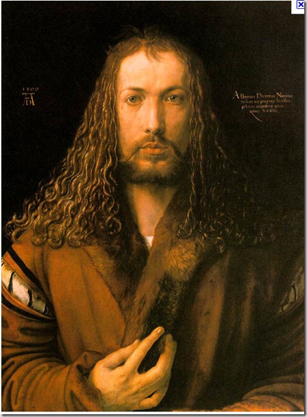
I’ve always been proud of this. Over the years it has stood as a reminder that I can actually draw, if I’d apply a bit of effort. Yes, I have a long way to go, but it is a possibility.

This is Mr. Durer’s version:


Albrect Durer Original