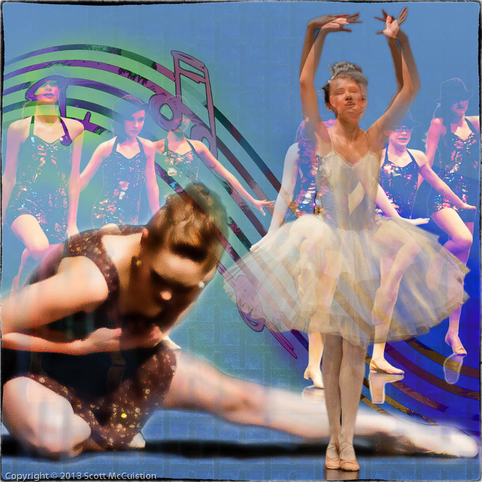
As I mentioned in the previous post, I wanted to do another version of the Dance Composite with wider grid lines. So I went back to the previous image and pulled out the gird lines so they where wider. That actually made the grid MORE powerful. Everything became more – blacker, heavier, bigger. The opposite of what I was going for. So I tried different things to minimize the grid. I ended up minimizing it to the point of almost eliminating it. As I looked at it it felt like the grid didn’t really fit the rest of the elements. So I added just enough to use it to tie the overall image together, without being a significant element. At least that’s what I tried to do.
Tell me which you think works best:
The first:
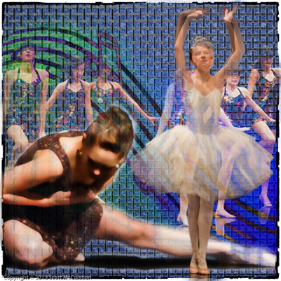
The revised: